

Crack Open our New Packaging for Winterport Winery Cider
Coming off a successful rebrand for Penobscot Bay Brewery that visually tied their line of products together and provided a much-needed presence on shelf, their sister company Winterport Winery, asked Hydrogen to create a design system for their line of hard ciders.
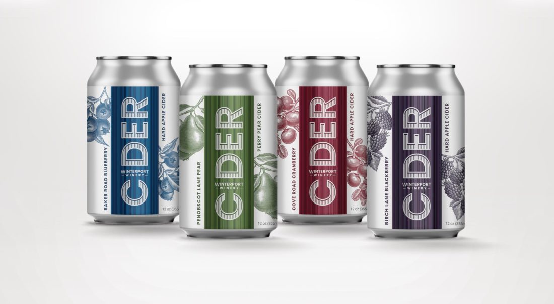
The design took cues of what we did for their beer rebranding—marrying modern graphics with a more traditional style of illustration. Winterport Winery named all their ciders after streets in Maine along with the accompanying flavor including Baker Road Blueberry and Birch Lane Blackberry, which provided both with visual cues of fruit. Creative Director and Design Lead Michael McGrath explained how his team overcame a major design hurdle: “The main focus of the design is the word CIDER turned on its end, the “I” replaced with the Winterport Winery name. All is surrounded by a vertical field of color bands drawn straight from influence of each flavor—offering clear guidance at shelf that this is hard cider, and it’s premium.” Each flavor showcased original scratchboard illustrations of cranberries, blueberries, blackberries or pears created by Maine native, Bruce Hutchison.
To continue the whimsical voice of the brand, Hydrogen created witty verbal descriptions of the flavors as well—the “perfectly perfect” Penobscot Lane Pear or the “delightfully oxymoronic sweet/tart finish” of Cove Road Cranberry.
In the end, the labels mirror that of the product itself. Simple, while elegant. Bold, yet understated.


